Hannah Brasier came back to our studio this week to speak to us about her work in Korsakow, her approach to making k-films and the research that has informed her work. I found the whole thing really refreshing, and I’m suddenly rethinking the entire direction of our project. I wish that she had presented to us 3-4 weeks ago; week 9 seems like a terrible time to start questioning everything you’ve produced to date, and how you’re going to go forward!
The thing that stood out most for me in Hannah’s presentation was her reference to Manovich’s ideas around the relationship between the interface and the database. She clearly thought about this in her k-films: her use of a list-style interface for the first k-film about noticing, and clustering the clips by theme using slightly different interface designs to highlight a “change” of cluster. Again in subsequent films, her interfaces were simple but used subtle differences to highlight these changes (or “pinch points”, as she called them).

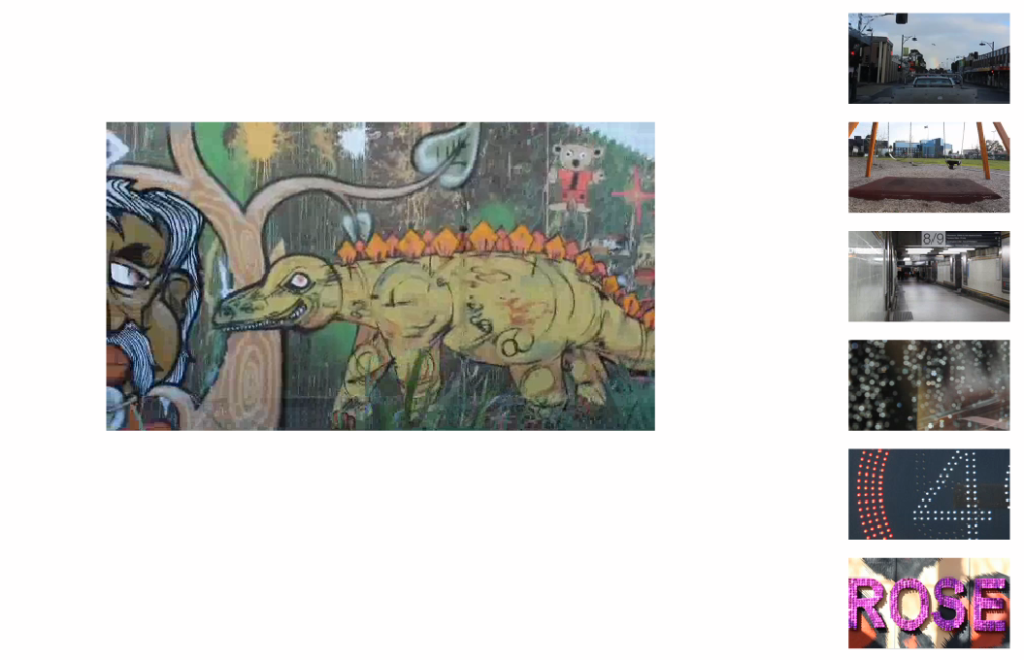
Screenshot from Hannah’s Honours work, ‘Noticing‘
This is an interesting way to start thinking about UX design. How does the database dictate or inform what the interface should do/look like/be? Does it need to be visually engaging, or should it be simple and use basic elements to let the content itself guide the user’s journey?
These new concepts are making me rethink our editing decisions, and how we’ve used the footage we have so far. It’s just so linear, or as my OH might say, “it’s so durr-uh-gurr!” (I’m pretty sure he means de rigueur). I’m starting to want to move into abstract, unchartered territory, and play with what we’ve got more. Take the audio we’ve got and layer it over new footage; footage that may be related, but maybe not. Just play.
Is it too late in the semester to do that?